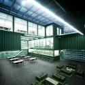
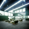
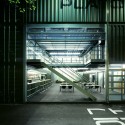
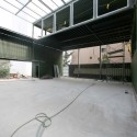
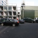
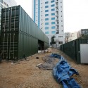
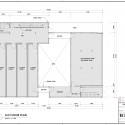
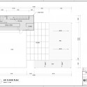
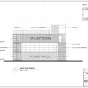
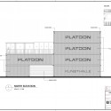
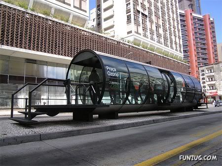
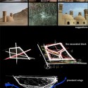
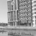
zaha hadid: beko masterplan in belgrade
zaha hadid: beko masterplan in belgrade


+ نوشته شده در ساعت توسط Mr.Hamed Khakpour
|
Zaha Hadid Wins Japan National Stadium Competition


Sunwell Muse Kitasando / Takato Tamagami and Tsutomu Hasegawa


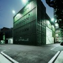
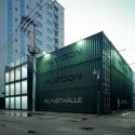
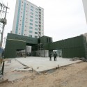
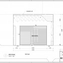
Cafe la Miell by Suppose Design Office


|
Taiwan favours international design for TCDC | ||||||
 | ||||||


Gigon / Guyer

Photos from gigon-guyer. ch.
In Progress: Z Towers / NRJA


Automotive Showroom and Leisure Centre by Manuelle Gautrand Architecture

Serpentine Gallery Pavilions over the years


Architect: Vicens & Ramos / Ignacio Vicens y Hualde, José Antonio Ramos Abengózar
Location: Rivas-Vaciamadrid, Madrid, Spain
Client: Obispado de Alcalá de Henares
Collaborators: Fernando Gil, Agustín Toledano, Roberto Rodríguez-Paraja, Jesús Gómez, Desirée González, Pablo Gutiérrez, Romina Barbieri, Raúl Rodríguez, Tibor Martín, Patricia de Elena
Photographs: Pablo Vicens y Hualde & Ricardo Santonja


Seen at Gizmodo. More images after the break.


هتل شناور در سوئددر این هتل همه امور اجتماعی در جریان هست و مهمانان میتوانند از هوای خوب و دریای بی کران لذت ببرند و شبها در کنار صدای امواج به خواب بروند
|
اولین هتل ماسه ای جهان به شکل یک قلعه در ساحل Weymouth در شهر ساحلی Dorset در بریتانیا است.

V-Houses, an amazing jungle retreat near the fishing village of Yelapa in tropical Mexico. این دیگه خیلی جالبه . وسط جنگل با حال و هوای بکر طبیعت تازه اونم با همچین معماری عالی و عجیبی . درست شبیه اهرام وارونه هستند اما خودشون بهش میگن موشک هتل .
این هتل در یک جنگل گرمسیر در نزدیکیهای دهکده ماهیگیری Yelapa در کشور مکزیک قرار دارد.


یخ هتل منحصر به فرده و هرجور حساب کنید یک تجربه منحصر به فرد و غیر قابل قیاس هست و یه جور خود آزاری هم محسوب میشه .

به اینها میگن هتل کپسول . احتمالا باید خیلی هم ارزون باشه . اما من که یاد قفسه های سردخونه افتادم.

هتل امدادی ، که استفاده ای دیگه از جعبه بقای هست ، در یک کانال در آمستردام هلند واقع شده است. ازین جعبه ها در پای دکل ها و سکوهای دریایی استفاده می کنند.

یک هتل غیر عادی با فضایی افسانه وار و یک محیط کاملا عجیب و غریب. یه جورایی مثل کندوان خودمونه . فقط اونا میدونن باید چجوری جاذبه هاشون رو معرفی کنن و ما هم فقط تماشا می کنیم.

هم اکنون شما می توانید شب را در یک جت واقعی اقامت داشته باشید.

به این میگن یک صمصمیت حقیقی با طبیعت. حیات وحش و آماده برای دریافت تجارب فوق العاده و شگفت انگیز واقع در قلب طبیعت و حقیقت.

یک مسکن لوکس در عجیب ترین شرایط ممکن.زیر دریا .. باید خیلی جالب باشه.

این یکی دیگه باور نکردنیه . این اتریشی ها معماری و سبک کارهاشون همیشه عجیب و غریب بوده.


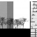
section


by Studio Pei-Zhu
Seen at designboom. More images after the break.


construction process construction process construction process


Cloud Tower by the next ENTERprise - architects


Darcons Headquarters by Arquitectura en Proceso


Mirage by Kjellgren Kaminsky Architects


–


|
'Faceless' Science Museum redesigned | ||||||
| ||||||
Plans revealed for the redesign of the ‘faceless’ Science Museum on London’s Exhibition Road are to recreate the space as a ‘Museum of the Future’, aiming for completion by 2015.
As part of a wider regeneration of the Exhibition Road revitalisation as the ‘cultural heartland of London’, the Science Museum will undertake a redevelopment designed by Wilkinson Eyre Architects which incorporates a new facade, new galleries, lifts and SkySpace - a cavernous rooftop space and 'destination cafe' dedicated to cosmology. “I really like the concept that there’s so much going on in the museum that they’re kind of fighting to get out,” says Paul Baker, Wilkinson Eyre Director and architect for the project. He is describing the Beacon, the glass and light façade set to burst out from within the existing columned entrance. Acting like a lighthouse for the Museum, the Beacon will allow the building to be acknowledged from either end of Exhibition Road and create an entrance to inspire and excite visitors. Its underbelly will act as a screen entertaining and enticing visitors. The redesign is an extension of the partnership between Wilkinson Eyre and the Museum which has developed over the past 15 years as they have collaborated on the ‘Museum of the Future’ framework devised to bring the museum through into its centenary year. “We’ve enjoyed working with Wilkinson Eyre in the past as they are one of those firms that work in a space between art and technology,” says the Museum's Head of Creative Direction, Tim Molloy. “They bring a vivacity to engineering which we very much enjoy.” The redesign celebrates the Museum’s centenary year and is seen as an opportunity to pull the museum into the 21st century. Molloy explains that it is also a chance to change perspectives: “We’ve always been known as a museum that’s interactive, really for the last 100 years. Where you can see things as well as do things. That’s something that has been commonly misinterpreted as being about kids...that’s something we want to change to show that it’s about creating conversation.” On a functional level, the new design will resolve acknowledged movement issues upon entering and within the building. “The building is made up of a long thin sequence of spaces culminating in the welcome wing. The idea was that we created some visual identity between floors. As you go deeper into the building you kind of lose the identity of the different floors,” said Baker noting that the visitor tends to work across the ground floor. “The way we worked here is we made a computer model of the building. We looked at the shapes and relationships all down the building and worked out how we could manipulate them.” Part of this manipulation is the inclusion of three new lifts which encourage upward circulation. The entrance will also be opened up with multiple entrances reducing the bottleneck effect previously suffered.


|
A hall for peace | ||||||
| ||||||
The project of the UN Peace Park was initiated by the City of Chungju in honour of the current General Secretary of the United Nations Organization and native of Chungju, Ban Ki-Moon. The project will be the new cultural landmark for the city, spreading out along the banks of the river Namhangang and to the north of the Natural Park Tangeumdae. This cultural aspiration culminates in the design of the new UN Memorial Hall, creating a new landmark building for Chungju.
The UN Memorial Hall is an ellipsoidal building with a maximal diameter of 60m. It is made of 8 storeys and 1 basement floor. The heart of the building is the 1,500 seat auditorium and auxiliary conference spaces. The auditorium will offer a view to the outside direction of the Tangeumdae Natural Park. Spiraling upwards, the continuous ramp houses an exhibition explaining the history of the United Nations between 1945 and today, finally culminating in the Gallery of the General Secretaries. The human being, center of interest of the United Nations mission will be the protagonist and integral part of the architecture and appearance of the UN-Globe. The UN-Globe will be placed in an orchard of 192 apple trees representing the number of member states of the UN.


Kindergarten Sighartstein by Kadawittfeldarchite ktur


|
Commanding design for sea resort | ||||||
| ||||||
Designed by BBG-BBGM, The Astra-Montenegro Tower and Wave buildings function as the dramatic centerpiece of a bold new five-star luxury mixed-use development in Budva, Montenegro. The project site, a wooded, steeply sloping peninsula along the Adriatic Sea separating the Budva and Bicice waterfronts, represents a coveted piece of this rapidly-developing region and demands an iconic form of equal drama. In order to fulfill this, BBG-BBGM's design concept involves weaving a dialogue between two complimentary forms: the iconic sail-like Tower and the attached low-rise Wave building.
The 26-storey tower building is gently curved in plan and elevation, evoking the image of two sailboats racing across the bay below. The building’s north and south ends are split to reinforce the vertical articulation of the mass into two competing exterior 'shells'. A taut, unitized glazing curtain wall system at the ends of the building is met by gently curving balconies, clad with a fritted glass rail. The inset walls at balcony level are double glazed storefront glass with sliding doors. Anodized metal panels on the face of the building visually separate these primary architectural elements. A series of horizontal anodized metal fins with back-lit glazed panels illuminate the cap of the building’s “sails.” The base of the Tower is anchored with limestone slabs that step out of the exposed rockface, sloping dramatically to the Adriatic Sea. The entry pavilion is glazed in a structural glass system to allow maximum inside/outside visibility, and creates a separate arrival experience and identity for the residents. In contrast to the Tower, the Wave building is linear in nature, terraced into the side of the slope. The Wave’s defining architectural expression is created by a continuous sweep of serpentine balconies. The balconies are faced in a rain screen panel and a projecting sunscreen of anodized metal louvers. The Wave’s western façade is glazed with continuous balconies overlooking the Budva Riviera, while the longer eastern façade consists of a wood panelized rain screen system. The length of the eastern wall is broken up with projecting stair and lift elements that reveal themselves through backlit frosted glass panels. The Wave’s units are accessed by a series of serpentine single loaded corridors allowing all units to be oriented to the waterfront.


Digital origami

Rome architects AKA Architetti have won a competition to design a television and learning centre in Italy with this design, entitled Digital Origami.

The design will be built in the former Italcitrus packaging plant in Reggio Calabria, Italy.

The complex will comprise television and audio-visual production facilities, as well as exhibition spaces for temporary installations and film festivals.

The project involves restoring four of the six existing buildings, demolishing the other two and construction a new, semicircular building with a piazza at its centre.

The new structure will be covered with a mesh, illuminated at night to project messages to the surroundings.

The ground floor will house studios, laboratories, workshops, administrative offices and exhibition spaces, while the first floor will include a cafe, bookshop, offices and classrooms, open to the public.

Here’s some more information from AKA Architetti:
–
International competition – First Prize
Digital Origami
The intervention represents a distinct urban and landscape sign. Not only the broadcasting antenna and the new building but also the entire complex as well as the surrounding terrain were sculptured and were intended to be a piece of land art.

During the night the centre is engulfed by an illuminated net that emerges from the terrain spreading and arriving to the top of the broadcasting antenna/sculpture, visible from afar. The centre it self becomes an instrument of communication, an interactive device and not only a passive container. The Net that enwraps the centre has another function as a bio climate skin. It has bi phase ecologic system; passive, hot/cold protection, and active, with the insertion on photovoltaic panels.

The distribution plan for the new complex is divided in 2 levels, on the ground level are located the more operative spaces, scenographic and tailoring workshops, laboratories, studios, administration offices and in the corresponding new building area an exhibition gallery. On the level above are the public designated areas such as the cafeteria, bookshop, offices and teaching classes. On the same level a suspended visiting path is programmed in order to allow the visitors to view the various activities without interfering.

On the non built areas is planned an equipped public park that participate in the centre activities, the terrain is sculptured in a fractured way that allows to collocate the parking areas and the technical rooms underneath it.

The competition was announced on April 2008 with the submission deadline on September 2008, the jury decision was publicly announced on March 2009. The project contract is foreseen to be held near the end of 2009. The construction timeline stands on 18 months.
“Ce.Te.S” International Competition For An Experimental Television Cultural/Didactic Center In The Former Italcitrus Packaging Plant In Reggio Calabria, Italy.
Organizers: Reggio Calabria local authority.
Development cost: 6.650.000 €
Area: 10.200 sq m
AKA ( AKA - Caccavale, Casadei, Pineschi Associated Architects)
Design team: Federica Caccavale, Alessandro Casadei, Paolo Pineschi, Nadav Engel
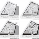
Punta Umbria Pavillion / MRDP Arquitectos


Location Plan Ground Floor Plan Second Floor Plan Elevation 01


![]()
Elevation 02 Section 01 Section 02
Matchbox / Allard Architecture


The Amazing Avenel House in Victoria, Australia


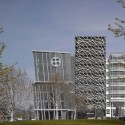
massimiliano fuksas: mab zeil to open on february 28th
'mab zeil' in frankfurt, germany designed by massimiliano fuksas will open on
february 28th. the building which took approximately 5 years to construct is
comprised of a 4 star hotel with conference centre, a fitness centre, a cinema
and office space.
fluent in form the building is connected by 2 major poles one at the zeil side
and the other at the TT side, where entrances are located for the hotel and offices.
the hotel's lobby is located in the reconstructed TT building, next to an art gallery
and the more luxurious shops that form the end of the shopping mall. the lobby is
connected with the rooms via elevators. in between there are connections on the 3rd
and 4th floor with the conference centre and sport facilities. escalators bring employees
up to the fourth floor in a 27.5 meter entrance hall.


Urban Mediaspace by Schmidt Hammer Lassen


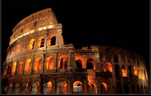
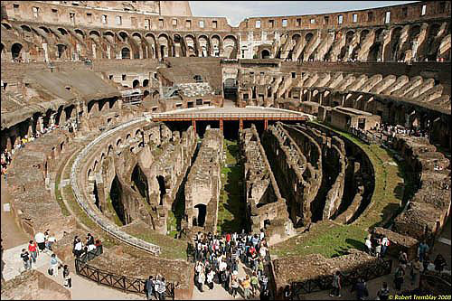
زیبایی های شهر رم
رُم پایتخت کشور ایتالیا و همچنین مرکز استان لاتیوم ایتالیا است. رم در کنار رودخانه توره و در نزدیکی دریای مدیترانه قرار گرفته است. کشورواتیکان در درون شهر رم قرار گرفته است.
از استودیوهای معروف و تاریخی فیلم در رم چینه چیتا است و بقایای کو لوسئوم ، آمفیتئاتر معروف رومی نیز در همین شهر است.
تاریخ رم
تاریخ رم را معمولاً از ۲۲ آوریل ۷۵۳ قم، تاریخ سنتی بنیانگذاری شهر رم (که در دورهای مبدأ تاریخ بهشمار میآمده)- تا ۴ سپتامبر ۴۷۶، یعنی تاریخ برکناری رمولوس آگوستوس، آخرین امپراتور رم غربی در نظر می گیرند.
این دوازده قرن تاریخ را ادوارد گیبون، سیاستمدار انگلیسی سدهٔ ۱۸ و مشهورترین مورخ تاریخ رم، در ۶ جلد جا کرده و ویل دورانت، یک جلد ۹۰۰ صفحهای از تاریخ تمدناش را به آن اختصاص داد
تاریخ رم با افسانه شروع میشود. انیید، یکی از بازماندگان شهر تروا در آن جنگ افسانهای، به سرزمین ایتالیای امروزی میآید. نوادگانش رموس و رمولوس، بنا به دستور پادشاهی که پسران را میکشته، به آب افکنده میشوند و از قضا، توسط مادهگرگی پرستاری و بزرگ میشوند. و بعدها این دو تن، شهر رم را بر روی هفت تپه نزدیک به رود تیبر بنیان میگذارند. این افسانه، خالی از حقیقت هم نیست. بنیانگذاران شهر رم، مردمانی غیر از ساکنان بومی سرزمین ایتالیا بودند که امروزه قوم و تمدن شان به نام اتروسکانی شناخته می شود. آن طور که محققان حدس میزنند، کسانی از بابل یا الهام گرفته از تمدن بابل بودند که به رم آمدند و شهرنشینی را به آن سرزمین آوردند
تاریخ رم، سه دوره آغازین و جمهوری، امپراتوری، و افول و سقوط امپراتوری را شامل می شود. سنای رم، مجلسی که به تقلید از یونانی ها برپا شده بود، بازیگر ثابت هر سه دوره بود. در ابتدا، پس از منازعات فراوان، اختلاف طبقاتی بین اشراف و تودههای زیردست برداشته شد و جمهوری شکل گرفت. رمیها به خاطر ارتش منظم شان توانستند قلمرو خود را از دشت های پیرامون رم (موسوم به لاتیوم، یعنی سرزمین مردم لاتین) به کل ایتالیا گسترش بدهند (۲۳۸ قم). بعد نوبت تسلط بر دریای مدیترانه بود
رمی ها بر سر تصرف جزیره سیسیل با دولت کارتاژ درگیر شدند و بعد از سه جنگ بزرگ، عاقبت (در ۱۴۹ قم) دولت کارتاژ که روزی بر تمامی ساحل دریای مدیترانه، از سیسیل تا اسپانیا تا آفریقا حکومت میکرد، به کلی نابود شد. یونان هم (در ۱۲۹ قم) به دست رمیها افتاد. امپراتوری شکل گرفته بود
با ظهور چهره قدرتمندی به نام ژولیوس سزار، اختلافات داخلی تمام شد و جایگاه امپراتور به عنوان بالاترین قدرت و مظهر اراده رم شکل گرفت. در دوره طلایی (۲۷ قم تا ۱۹۲م) آنها به همسایگی امپراتوری ایران رسیدند و رم از شهری آجری به شهری از مرمر تبدیل شد. تمام ادیبان و فیلسوفان مهم رم در این دوره زندگی می کردند و اکثر داستان های رم باستان، مربوط به این دوران است. پادشاهی کومودوس پایان عصر طلایی بود
بعد از او، دیگر هیچ چیز مثل قبل نبود. سرداران کشور را چند پاره کردند و اختلافات بین هواداران مسیح و کافران به کیش جدید هم به این چندپارگی افزود. کنستانتین، تنها امپراتور بزرگ پس از عصر طلایی، کشور را متحد کرد، مسیحیت را آئین رسمی اعلام کرد و شهر کنستانتینوپل (استانبول) را به عنوان پایتخت جدید ساخت (۳۳۶م). با این کار البته میراث رم تا قرنها بعد در امپراتوری بیزانس حفظ شد، اما در واقع کنستانتین به شهر رمولوس خیانت کرد. با مرگ او، امپراتوری به دو بخش غربی و شرقی تقسیم شد (۳۹۵م). فاصله این دو پاره امپراتوری، مدام با هم بیشتر میشد. دیگر نه رم شرقی تاب مقابله با امپراتوری ایران را داشت و نه رم غربی می توانست مانع از هجوم هونها و وندالها و گوتها و سایر اقوام بیابانگرد بشود. آتیلا (در ۴۴۴م) رسما برای حمله نکردن به رم از امپراتوران غرامت میگرفت. اوضاع در داخل امپراتوری از این هم عجیبتر بود
یکی از آخرین امپراتورها، خودش هم از این که به مرگ طبیعی میمیرد و هیچ کس علیهاش توطئه نکرده در تعجب بود. آخرین امپراتور رم، پسربچهای به نام رمولوس اگوستوس بود.[نیازمند منبع] ادووآکر، پسر ادکون، وزیر ایتالیا با تهاجم به رم، به سادگی او را از پادشاهی خلع کرد (۴۷۶م) و پایان امپراتوری رم را اعلام کرد. او دستور داد از آن به بعد، آن سرزمین را ایتالیا بخوانند

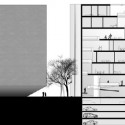
Located in South Korea, the apartments are built using oblique lines in which each unit consists of a terrace.
The building, designed by Korean firm Unsangdong Architects, consists of various community spaces which include parks, leisure facilities, event space, a library, media space and performance space.
Seen at designboom. More images after the break.


Queens Museum of Art by Elliot White

Elliot White, a 3rd year architecture student at Pratt Institute in New York has sent us these images of his conceptual design for a redevelopment of Queens Museum of Art at the World’s Fair site in Queens, New York.

The design is raised off the ground, creating a public space underneath that can be used for events when the museum is closed.

The building would be constructed using a lattice structure, covered with a layer of concrete. During construction a huge plastic bag would be inflated inside the structure to support the concrete until it hardened.

The museum is intended to contain a model of New York City’s five boroughs.

The information below is from Elliot White:
–
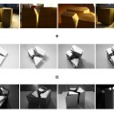
This project was completed in the fall of 2008 under the direction of David Ruy and Karel Klein of RuyKlein. The intention was to develop sensitivities to surface conditions. The work included physical and digital modeling experiments in cloth. The site is a redevelopment of the Queens Museum at the World’s Fair site in Queens, New York. The museum contains a permanent display of a very large-scale model of New York City’s five boroughs.

Unexpectedly the physical modeling of the cloth produced a most interesting and unintended result. This unexpected result however, provided a fantastic jumping off point for digital exploration. By raising the program off the ground level a public space is created under the building that offers access round the clock, offering space for events even when the museum is closed.

A structural lattice provides ample interior spaces while creating a process that significantly simplifies construction. A plastic ‘bladder’ is inflated inside the structural lattice, then a layer of Concrete Canvass is laid on top, sprayed with water, and sets on the outside of the lattice.

As for the interior, I wanted to create a sense of corporeality. To accomplish this I have taken the top lines of the interior of the shell and pulled them out in a manner that creates a landscape that must be negotiated in three dimensions. The interior walls would be constructed out of stacked glass, creating translucent divisions of the rooms.


این برج شهر عمودی نام گذاری شده است.
password: www.memari.plb.ir
password: wWw.Memari.PLB.ir
غرفه ی دانمارک در نمایشگاه جهانی شانگهای - ۲۰۱۰

طرح توسط یکی از مشهور ترین گروه های معماری دانمارک، به نام BIG داده شده است که توسط معمار معروف دانمارکی، Bjarke Ingels تاسیس شده، که در ارائه ی گویا و دقیق طرح هایش از بهترین ها محسوب می شود. پروژه برای نمایشگاه جهانی شامگهای که قرار است در سال ۲۰۱۰ برگزارشود داده شده است و در آن به صورتی افراطی، از تمامی المان هایی که بیانگر دانمارکی بودن مجریان طرح باشد استفاده شده، به طوری که می توان آن را بخشی از خاک دانمارک به شمار آورد.
طرح کلی، شامل یک راهروی عظیم مارپیچ است که شرکت کنندگان و بینندگان نمایشگاه، می توانند از بین غرفه های آن حرکت کنند، و جالب اینکه این راه ها مانند راه ها و خیابان های دانمارک طراحی شده! در مرکز این راهرو های پیچ در پیچ، استخری بزرگ قرار گرفته که مانند لنگر گاه های دانمارک است و در مرکز این استخر، مجسمه ای از یک پری دریایی قرار گرفته که نمادی از دانمارک محسوب می شود و به صورت موقت و تنها برای این غرفه، از دانمارک به چین حمل خواهد شد.


ده اتفاق برتر باستان شناسی جهان در سال گذشته
هر روزه اتفاقاتی مختلفی در حوزه باستان شناسی رخ می دهد که باعث می شود اسرار دنیای باستان هر یک پس از دیگری افشا شود.باستان شناسی قبل از این که یک علم کاملآ دانشگاهی به شمار رود یک هنر برای پیوند زدن یافته ها با شواهد تاریخی است . هنری که با پیوند زدن زنجیرهای کوچکی که در دنیای باستان شناسی وجود دارد باعث می شود تا پازل دیگری بر گمشده های دنیای باستان اضافه شود.
از دیگر سو شاید مهمترین اصل در علم باستان شناسی صبوری و مطالعات زیاد باستان شناسان باشد که باعث می شود این علم نسبت به دیگر علوم رنگ و رویی دیگر به خود بگیرد.
اصولآ در حوزه باستان شناسی یا مطالعات دامنه دار است و طولانی که بر روی یک محوطه تاریخی به طور متناوب و در طول مدت چند سال صورت می گیرد و یا آنکه بر اثر یک اتفاق یا کاووشی یکباره قطعه دیگری از این پازل برای بیان حقایق بیشتری از تاریخ رو می شود.
اما در میان اتفاقاتی که در حوزه باستان شناسی رخ می دهد برخی از این اتفاقات به خود شکل دیگری می گیرند و با توجه به نوع کشف و برد جهانی و مسایل دیگری که نشان از چگونگی زندگی انسانی در دوران باستان دارد از همه بیشتر جلوه می کند..
این اتفاقات که در دنیای باستان شناسی تنها هر از چند گاهی رخ می دهد و شاید در برخی موارد سالها صبر و حوصله رامی طلبد در سال گذشته میلادی در ده مورد باعث شد تا شگفتی باستان شناسان و علاقه مندان به علم باستان شناسی را بر انگیزد.این ده مورد اکتشاف که از ابتدای سال گذشته میلادی تا انتهای آن مورد بررسی قرار گرفت تا آنجا پیشرفت رفته است ، که در برخی از این موارد، روند مطالعاتی دانشمندان این حوزه را به سمت و سویی جدید تر رهنمون ساخت.
در این مطلب به اختصار به ده کاووش برتر باستان شناسان سراسر جهان اشاره شده است

1- کشف گور دسته جمعی
یکی دیگر از کشفیات باستانی که باعث شد در سال گذشته نظر بسیاری را به خویش معطوف دارد ، کشف یک گور دستجمعی از طاعون زده هایی است در جزیره کوچک قرنطینه شدگان در نزدیکی ونیز رخ داد..این کشف که در 29 آگوست سال گذشته رخ داد باعث شد بسیاری از محققان و کاووشگران را به اینمنطقه باستانی بکشاند تا ایشان از نزدیک به باقیمانده های حادثه بزرگی که طاعون در اروپا به وجود آورد
و به واسطه آن بسیاری از اطلاعت این بخش از تاریخ نیز دفن شد دوباره بازیابی نمایند.در این گور دستجمعی بیش از 1500 اسکلت پیدا شد که همگی متعلق به بیمارانی است که نوع خاصی از طاعون را به نام طاعون خیارکی که همگی در جزیره ای کوچک در نزدیکی ونیز دفن شده بودند .طاعون سیاه یا مرگ سیاه یک اپیدمی طاعون خیارکی است که کل اروپا را در سال ۱۳۴۷ تا ۱۳۵۰ میلادی دربرگرفت. تعداد مرگومیر از بیماری طاعون در این دوره کاملاً مشخص نیست، اما برآورد آن حدود یکچهارم تا پکسوم جمعیت اروپا، یا ۲۵ ملیون نفر طی این سه سال است. در اواخر سال ۱۳۴۷ کشتیهایی که از آسیای مرکزی میآمدند، بیماری را در جنوا و مارسی شیوع دادند. در تابستان سال ۱۳۴۸ طاعون در ونیز نیز شایع شد و در عرض یک سال تمام سواحل مدیترانه را فراگرفت. پس از آن، طاعون به سرعت به سمت شمال اروپا حرکت کرد و جمعیت این نواحی را، که پس از قحطیهای پیدرپی، اپیدمیهای مختلف به علت سردی هوا و جنگهای طولانی به شدت در برابر هر سانحهای ضعیف شدهبودند،درهم شکست. باستان شناسان معتقدند یا کشف این گور دستجمعی بسیاری از حلقه های فراموش شده این بخش از تاریخ باستان اروپا را که به واسطه شیوع این بیماری در بسیاری موارد پنهان مانده است را روشن خواهند کرد.

2- خانه های مردمان استون هنج
از مهمترین کشفیات باستانی در سال گذشته را می توان کشف بقایای روستای 4600 ساله سازندگان استونهنج به نام محوطه تاریخی دورینگتنوالز دانست که به عقیده باستان شناسان به احتمال فراوان یک روستای ابتدایی برای سکونت مردمان باستان بوده است.ساختار زیربنایی این محوطه تاریخی نشان از وجود نشانه های نخستین زندگی روستایی ی مربوط به دوران پیش از تاریخ است که در نزدیکی استون هنج پیدا شده است.کارشناسان معتقدند احتمال دارد که این محوطه تاریخی در واقع مقبره هایی باستانی باشد که در نزدیکی استونهنج برای انجام مراسم تشریفات و آیین های مذهبی از آن استفاده می شده است..در این کاووش باستانی 8 خانه دراین منطقه از زیر خاک خارج شد که پس از آن باستان شناسان احتمال دادند که 25 خانه دیگر نیز در این منطقه وجود داشته باشد.ابزار سنگی، استخوان حیوانات، پیکان و لوازم دیگر از این روستا به دستآمد که نشان از قدمت تاریخی این روستا دارد.
کشف بقایای خوکی که در هنگام کشتهشدن احتمالا نه ماهه بوده است، نشاندهنده برگزاری جشنواره در نیمه زمستان در این منطقه است.ازنکات دیگری که در مورد این محوزه تاریخی وجود دارد و بر اهمیت آن می افزاید ، این است که استونهنج به جهت طلوع خورشید در اواسط تابستان و غروب خورشید در اواسط زمستان قرار گرفته است و این درحالی است که دایره چوبی سایت دورینگتنوالز به جهت طلوع خورشید در اواسط زمستان و غروب خورشید در اواسط تابستان قرار دارد.بر اساس رای باستان شناسان دو خانه از خانههایی که در این محوطه تاریخی کشف شدهاند جدا از بقیه قرار داشته این احتمال وجود دارد که این 2 خانه سکونتگاه سران قبیله یا محل انجام مراسم مذهبی بوده است.
معماری مقبره سازی
ساختمانهای آرامگاه ها یکی از پرعظیمت ترین وشکوهمند ترین گروه های ساختمانیاست که معمولا بااستفاده از شرایط طبیعی جغرافیائی و در کنار ویاروی کوه و تعداد اندکی در دشتها احداث شده است.ترکیب بندی عمومی این مقبره ها به این قراراست قبرستان توسط دیوار احاطه گردیده و درب چهارطرف باز است و در چهار گوشه آن برج دیده بانی قراردارد و راهرویی در جلو قبرستان ایجاد شده وسراسرقبرستان زیر سایه درختان کاج و سروپربرگ وسرسبز و سربه فلک کشیده قرار داردو محیط یکپارچه سکوت و آرا مش بر آن حکمفرمااست.
آرامگاه" چین شی خوان "
اولین امپراتور چین آرامگاهای امپراتور "چین شی خوان "واقع در دامنه شمالی کوه "لی شان " درشهر"سی آن " استان"شن سی"مشهورترین قبرستان چینبوده و بیش از2000سال قدمت دارد. پیکره ها و مجسمه های سفالی و چوبی جنکجویان و اسبها ئیکه همراه امپراتور مرحوم "چین شی خوان" زیر خاک دفن شدهبودند ،همچون سپاه پاسداران این قبرستان بودند کهصاحب نهایت ابهت و عظمت رزمندگی بوده و اثار هنری حکاکی و تهیه شده بااستادی و مهارت عالی میباشند و هشتمین معجزه دنیا نامیده می شود که درسال1987در"فهرست اسامی میراث جهان " به ثبت رسید کمیسیون میراث جهان این امر را این طور ارزیابی کرد:آن پیکره های سفالی مشهور که دورادورآرامگاه امپراتور "چین شی خوان "ایستاده،با ژستهای گوناگون و متنوع و اسبها و کالسکه های جنگی و اسلحه همه آثار ظریف ومکمل رالیستی بوده و در ضمن ارزش عالی تاریخی خود را محفوظ می دارد.
در اطراف شهر "سی آن " استان "شن سی " مقبره های امپراتوران و شاهزادگان سلسله ها متمرکز است،علاوه برقبرستان یاد شده ، مقبره های 11 امپراتورحان غربی و 18 امپراتور سلسله"تان "در این محلهامحفوظ است. درمیان آرامگاههای امپراتوریسلسله"هان غربی" مقبره "لیو چیه "امپراتور "حاناو"چه از نظر مقیاس و چه ازنظر وفور گنج های محفوظه زیر زمین متمایز و برتر از دیگر مقبره هامیباشد ،قبرستان "شائو لین " که درآن "لی شی مینامپراتور "تان تای تسون "مساحت زمین بسیاروسیعیرادر اشغال داشته و در محوطه آن 17 مقبره مامورانعالی مقام ونزدیکان امپراتور نامبرده دراطرافمقبره وی دیده میشود.روی این قبرستان و زیر زمینآن سرشار ازآثارگرانقدر باستانی است. حکاکی بسیارعالی و ظریف سلسله "تان "موسوم به "6 اسب ممتاز"ازشهرت بسزائی برخورداراست
آرامگاههای امپراتوران سلسله های "مینگ "و " چینگ
آرامگاههای امپراتوران سلسله مین بطور عمده درشهرستان "چان پین "در حومه بیجینگ قرار دارد ومجموعه آرامگاه های 13 امپراتور سلسله مینمیباشد.این 13 امپراتور بعد از آنکه بیجینگ بعنوان پایتخت اعلام شد، بر تخت سلطنت نشستند که مساحت حدود 40کیلومتر مربع را در اشغال خود دارد.وآین قبرستان مینگ نام دارد. این آرامگاهها متمرکزترین و کاملترین مجتمع آرامگاه ها موجود در چین بحساب میاید و عظیمترین آنها مقبره "چان لین " (ازآن "جودی "امپراتور" مین چن زون ) و "دین لینمتعلق به "جو یو چینو امپراتور مین شن زونمیباشدنتیجه حفاری ها نشان میدهد که قصر هازی زیر زمینیدین لین" با سنگ مرمر بشکل گنبدی ساخته شده وتجهیزات آبکشی عالی در داخل بخوبی کار گذاشته گردیده و گنبدهای سنگی همچنان محکم مانده و نشستنکرده است که بیانگر فناوری عالی معماری پیشینیانچین در سازندگی بناهای زیر زمین است . آرامگاههایچینگ دون لین"که مساحت زمین 78کیلومتر مربعی رادر اشغال دارد، آرامگاههای خاندان سلطنتی است کهاز لحاظ مقیاس پرعظمت ترین و از لحاظ سیستم معماریکاملترین آرامگاههای موجود چین شناخته میشود. دراین آرامگاهها 5 امپراتور ،14 ملکه و بیش ازصدسوگلی امپراتور سلسله "چینگ "مدفون شده اندآرامگاههای عمده " چینگ دون لین " بطرزی بسیارظریف و دقیق وبا استادی ساحته شده است
تبيين مفاهيم معماري اطلاعات:
اصطلاح" معماري اطلاعات" درسال هاي اخيربه عنوان واژه اي تازه درطراحي نظام هاي اطلاعاتي و طراحي وب راه يافته؛ اما هنوزهم متخصصين درارائه تعريفي واحدازآن مشكل دارند. Martin White معماري اطلاعات را همچون اطلاع رساني مجموعه اي از ابزارها و روش ها مي داند كه توسط متخصصين درمقياسي وسيع براي حل مشكلات مديريت اطلاعات استفاده مي شود. Iain Barker درتعريف معماري اطلاعات مي گويد:" معماري اطلاعات اصطلاحي است جهت توصيف ساختاريك سيستم؛ يعني شيوه اي كه درآن اطلاعات سازماندهي، كدگذاري ومنتقل مي شوند." دراين تعريف معماري اطلاعات به مثابه يك سيستم فرض شده كه داراي ورودي و خروجي هايي است، با سيستم هاي ديگردرتعامل است وهدف خاصي را دنبال مي كند. D.Grant Campell درتشريح اين اصطلاح مي گويد:" معماري اطلاعات شباهت بسياركمي با موضوعات داراي رويكرد ذهني دارد، وبيشترشبيه به رويكردهاي فلسفي مثل پديده شناسي وساختارگرايي است." قانون كلينگر- كوهن تصريح مي دارد كه معماري اطلاعات چارچوبي يكپارچه براي ارتقاء يا نگهداري فناوري موجود وكسب فناوري اطلاعاتي جديد جهت نيل به اهداف راهبردي سازمان و مديريت منابع آن فراهم مي نمايد.
کشوری که تا ۳۰سال پيش چيزی به جز شنزار نبود اينبار به گفته شيخ محمد حاکم دبی «در پی ساختن تاريخی پر افتخار برای آيندگانش است».
 باید که ایرانی آباد داشته باشیم , دست در دست هم خواهیم ساخت ایرانی زیبا و پر از عدالت .....