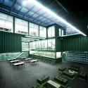
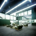
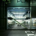
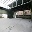
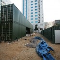
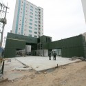
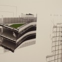
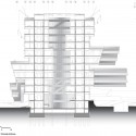
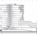
Wuxi Xidong Pedestrian Bridge / L&A Design Group
Wuxi Xidong Pedestrian Bridge / L&A Design Group


+ نوشته شده در ساعت توسط Mr.Hamed Khakpour
|
Wuxi Xidong Pedestrian Bridge / L&A Design Group
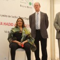
Zaha Hadid Wins Japan National Stadium Competition


Conceptual extension to Whitney Museum of American Art by Axis Mundi


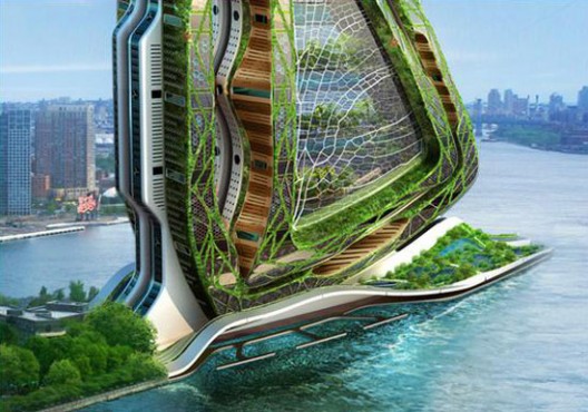
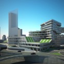
Dragonfly Vertical Farm concept by Vincent Callebaut

Majori Primary School Sports Hall by Substance


Kameha Grand Bonn interiors by Marcel Wanders


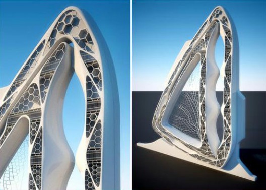
In Progress: Z Towers / NRJA


Frank, Ettore and Toyo by Chris Labrooy


Automotive Showroom and Leisure Centre by Manuelle Gautrand Architecture

Serpentine Gallery Pavilions over the years


Architect: Vicens & Ramos / Ignacio Vicens y Hualde, José Antonio Ramos Abengózar
Location: Rivas-Vaciamadrid, Madrid, Spain
Client: Obispado de Alcalá de Henares
Collaborators: Fernando Gil, Agustín Toledano, Roberto Rodríguez-Paraja, Jesús Gómez, Desirée González, Pablo Gutiérrez, Romina Barbieri, Raúl Rodríguez, Tibor Martín, Patricia de Elena
Photographs: Pablo Vicens y Hualde & Ricardo Santonja


Seen at Gizmodo. More images after the break.


هتل شناور در سوئددر این هتل همه امور اجتماعی در جریان هست و مهمانان میتوانند از هوای خوب و دریای بی کران لذت ببرند و شبها در کنار صدای امواج به خواب بروند
|
اولین هتل ماسه ای جهان به شکل یک قلعه در ساحل Weymouth در شهر ساحلی Dorset در بریتانیا است.

V-Houses, an amazing jungle retreat near the fishing village of Yelapa in tropical Mexico. این دیگه خیلی جالبه . وسط جنگل با حال و هوای بکر طبیعت تازه اونم با همچین معماری عالی و عجیبی . درست شبیه اهرام وارونه هستند اما خودشون بهش میگن موشک هتل .
این هتل در یک جنگل گرمسیر در نزدیکیهای دهکده ماهیگیری Yelapa در کشور مکزیک قرار دارد.


یخ هتل منحصر به فرده و هرجور حساب کنید یک تجربه منحصر به فرد و غیر قابل قیاس هست و یه جور خود آزاری هم محسوب میشه .

به اینها میگن هتل کپسول . احتمالا باید خیلی هم ارزون باشه . اما من که یاد قفسه های سردخونه افتادم.

هتل امدادی ، که استفاده ای دیگه از جعبه بقای هست ، در یک کانال در آمستردام هلند واقع شده است. ازین جعبه ها در پای دکل ها و سکوهای دریایی استفاده می کنند.

یک هتل غیر عادی با فضایی افسانه وار و یک محیط کاملا عجیب و غریب. یه جورایی مثل کندوان خودمونه . فقط اونا میدونن باید چجوری جاذبه هاشون رو معرفی کنن و ما هم فقط تماشا می کنیم.

هم اکنون شما می توانید شب را در یک جت واقعی اقامت داشته باشید.

به این میگن یک صمصمیت حقیقی با طبیعت. حیات وحش و آماده برای دریافت تجارب فوق العاده و شگفت انگیز واقع در قلب طبیعت و حقیقت.

یک مسکن لوکس در عجیب ترین شرایط ممکن.زیر دریا .. باید خیلی جالب باشه.

این یکی دیگه باور نکردنیه . این اتریشی ها معماری و سبک کارهاشون همیشه عجیب و غریب بوده.


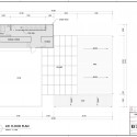
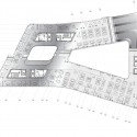
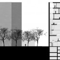
section


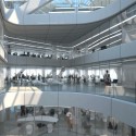
by Studio Pei-Zhu
Seen at designboom. More images after the break.


construction process construction process construction process
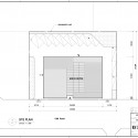
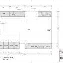
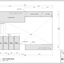


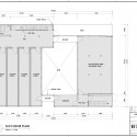
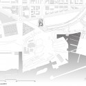
situation plan


Cloud Tower by the next ENTERprise - architects


Darcons Headquarters by Arquitectura en Proceso


Mirage by Kjellgren Kaminsky Architects


–


۷ پارادایم چارلز جنکس
چارلز جنکس بر اساس ارزیابی خاص خود از آثار معماری جهان، پاردایمها (Paradigm) یا الگووارههای مطرح معماری (از ابتدا تا دوران معاصر) را در هفت پارادایم به شرح زیر طبقهبندی میکند:
1. الگوهای مکانیکی این پارادایم از دیدگاههای مذاهب مسیحی و یهودی سرچشمه گرفته و از اعتقادات یونانیها در خصوص آفرینش جهان متأثر است. بر اساس این دیدگاه خداوند دنیا را بر پایه قوانین ثابت خلق کرده است که انسانها نیز میتوانند این قوانین را درک کنند. این دیدگاه به پارادایمی منتهی شد که کل کائنات را به شکل مکانیکی و با ساختارهای ماشینمانند در نظر میگرفت و هیچ جایی برای خلاقیت در آن باقی نمیگذاشت. این پاردایم مکانیکی تقلیلگرا و تقدیرگرا از سال 1600 تا 1950 بر عرصه هنر و معماری غرب مسلط بود.
2. معماری ارگانیک این معماری بر پایه اندیشه نزدیکی بین معماری و محیط زیست شکل گرفته است. این معماری نوعی فناوری الهام گرفته از طبیعت است که الگوهای طبیعی عیناً در آن تکرار میشود.
3. معماری مبتنی بر کامپیوتر در این پارادایم برای طراحی فضاهای شهری از کامپیوتر استفاده میشود. در این معماری هر شهر روند توسعه و گسترش خاص خود را دارا میباشد. این شیوه به نوعی معماری تمسخرآمیز منتهی شد که در طراحیهای آن (مانند کارهای رمکولهاوس) اثرات دنیای مدرن به شکلی متناقض و شعرگونه و تا حدی ناهنجار به تصویر کشیده شده است، شعری خشن و ناهنجار که از تناقضها بوجود آمده است.
4. معماری حبابگونه این پارادایم که بر نظریات آیزنمن استوار میباشد، در واقع تلفیقی است از طرح لایههای مختلف زمین. این شیوه به سطوح تاشونده متداخل متکی است که معماری قرون وسطایی را با نوعی تزیین که وجه عقلی و ذهنی دارد، به نمایش میگذارد.
5. معماری مبتنی بر اشکال زمین این معماری موجیشکل بر وامگیری تقریبی از شکلهای طبیعی موجود بر سطح زمین استوار است. در این پارادایم نیز از تکرار المانهای خاص استفاده میشود، اما این تکرار با تفاوتهای جزیی همراه است. اضافه شدن عناصر جدید باعث گسترش و تغییر سازمان اولیه میگردد. در واقع سازمان اولیه با این تغییرات خود را سازماندهی میکند و به این ترتیب در این تکرار در عین همانندی تمایز نیز وجود دارد و تکرار معنای واقعی خود را از دست میدهد. این پارادایم بر شعار بیشتر متفاوت است (More is Different) دلالت دارد. این الگوی معماری در کارهایی مثل بندر یوکوهاما کار دفتر معماری F.O.A (فرشید موسوی و آلخاندرو زائراپولو) به کار گرفته شده است. این بندر در واقع منظر مصنوعی (Artificial Landscape) ساخته شده از چوب و فلز می باشد.
6. معماری کیهانشناختی این پارادایم بر بحث سیارات، انرژی و کیهانشناسی استوار است. در تمام طول تاریخ، معماری از هستی وام گرفته است، بطوری که با شکلگیری ادراکهای نو درباره هستی، معماری جدید نیز بوجود آمد. این معماری بر گسست تقارن تأکید دارد و دیگر از دیدگاههای قدیمی معماری استفاده نمیکند.
7. الگوواره دال معماگونه این پارادایم از نظریات برگرفته از معماری پستمدرن است. بر اساس این الگوواره، برخورد با یک اثر معماری نگاه کردن به یک مجسمه سوررئالیستی است که معانی رازآمیز مستقر در آن بر پایه دهنیت بیننده شکل میگیرد. این نوع معماری با درک نظم عمومی طبیعت و با استفاده از خطوط سطوح و فضاهای طبیعی شکل میگیرد. معانی این رویکرد از معماری به طبیعت و تداعی آن در ذهن ناظر وابسته است. الگوواره دال معماگونه این پرسش را مطرح میکند که در دنیای معاصر که سیاست، مذهب، اجتماع و فلسفه یکسانی وجود ندارد، آثار معماری را چگونه طراحی و اجرا کنیم؟ چارلز جنکس پس از تشریح هفت پارادایم فوق، این پرسش را مطرح میسازد آیا در ابتدای پیدایش یک الگوواره جدید قرار داریم یا اینکه هفت پارادایم یاد شده بخشهای به هم پیوسته یک الگوواره جدید هستند؟
سبکهای معماری
آلترناتیو سبد


آلترناتیو کتابخانه


آلترناتیو دید از منشور


آلترناتیو فضای پر وخالی


آلترناتیو واژگون


ارمغانهای ایران به جهان معماری :« جناغ و کلیل »
در دل استان زرخیز خوزستان و نزدیک کشتزارهای نیشکر هفت تپه بازمانده های شهر باستانی دورانتاش به نام چغازنبیل خود نمایی میکند این کوه دست ساز را که هنرمند مردمی با فرهنگ در هزاره دوم پیش از میلاد مسیح در میان دشت برافراشته است نه تنها در زمان خود بی همتا بوده بلکه پیش و پس از آن زمان هم کمتر نمونه ای همانند آن پدید آمده است .
با سلام
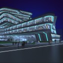
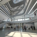
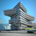
امروز چند تا عکس ازپروژه جدید آقای فوکساس این آرشیتکت ایتالیای آوردم و بعد دوباره می یام تا بازهم نمونه هایی دیگر رو از معماری امروز که بیشتر داره به سمت ساختار پیش میره می یارم . به راستی...
چرا ؟

این پروژه مربوط به مسابقه ای هست که ماکسیمیلیانو و داریانو فوکساس برنده مسابقه فرودگاه شنزن چین شدن می باشد .
 باید که ایرانی آباد داشته باشیم , دست در دست هم خواهیم ساخت ایرانی زیبا و پر از عدالت .....